Single Health
Case Study of The Single Health Record
Role: Product Design
Tools: Figma, Lottie files, Photoshop
Year: 2026

About The App
HealthTrace (The Single Health Record) is an AI-powered personal health companion built to pull together scattered medical records into one simple, trustworthy timeline. By combining camera scanning for paper prescriptions, a visual 3D body symptom tracker, smartwatch vitals syncing, and an instant 1-page summary for your doctor, the app turns confusing health notes into clear, easy-to-understand insights.
Problem
Statement
Managing ongoing health requires tracking scattered data across four disconnected formats—paper prescriptions, email lab PDFs, handwritten vitals notebooks, and smartwatch activity. During high-stress visits, this fragmentation causes anxious patients to forget key medical details, while time-pressed doctors operating in 10-minute limits lack the context needed to treat symptoms safely, ultimately delaying care.
Possible
Solution
To fix health data fragmentation without extra work, HealthTrace is an AI-powered single health record mobile app. It pulls paper scripts, lab PDFs, home logs, and watch data into one clean timeline. Using camera OCR and a Two-Tier Data Model, handwritten scripts become digital text cards while embedding an inline photo of the original paper proof. The app flags vitals trends with calm AI alerts and lets users send a 1-page summary to their doctor via WhatsApp in seconds.
Design Process
Set Goals
User research
Identify opportunities
Prototyping
Review
In-Depth Interviews
Competitive Analysis
Affinity Mapping
1
Discover
User Personas
Journey Map
Information Architecture
2
Define
3
Wireframes
Design Systems
Hi-Fi Prototyping
Develop
Usability Testing
Implementing feedback
4
Test
01
How do you keep track of your paper scripts, lab PDFs, and home vitals logs right now?
02
Have you ever misplaced a script or lab result right before a doctor's visit?
03
Do you struggle more with paper records or digital PDFs scattered in your email inbox?
04
Have you ever forgotten to tell a doctor about a past bad reaction to a medicine?
05
Do you track vitals on a smartwatch or in a paper notebook?
06
How often do patients show up with a pile of loose, unordered paper scripts?
07
How often do patients show up with a pile of loose, unordered paper scripts?
08
Have missing records ever made you hesitate to prescribe an aggressive medication?
09
What is your biggest concern about storing all your health data inside one mobile app?
10
Would you prefer sharing your health summary via WhatsApp or printing a physical page?
11
How do you summarize months of health issues when meeting a new doctor for the first time?
12
Would a 1-page health summary speed up your initial consultation process?
13
What makes a patient-provided health report easy to read in under 30 seconds?
14
What 3 key pieces of information do you need to see first on a patient's summary sheet?
15
What would make you trust an AI camera scan of your handwritten prescription?
16
How can the experience minimize cognitive load?
17
How do users build trust in AI-generated outputs?
18
How hard is it to recall exact drug names and dates during a high-stress appointment?
19
Can you usually read your doctor’s handwritten prescriptions, or is it a guessing game?
20
How can the product encourage long-term engagement?
21
How can multiple workflows exist without overwhelming users?
22
How should an app alert you about high blood pressure without causing panic?
23
How should visual hierarchy guide attention?
24
Which interactions deserve emphasis and which should disappear?
25
Do you prefer looking at visual vitals trend lines or raw daily number logs?
26
What moments of delight can improve the experience?
27
What is your biggest concern about storing all your health data inside one mobile app?
28
How much of a 10-minute visit is wasted trying to figure out a patient's past history?
In - Depth Interview Questions
Research insights derived from user interviews, academic literature, and AI-assisted analysis as a Secondary Research.

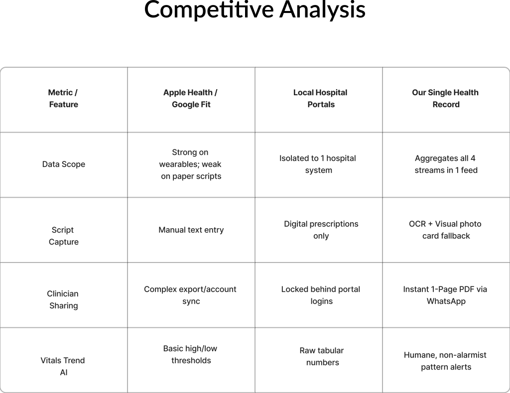
User Persona
College Student & Patient
Name
Ali
Age
24
Behavior
Stashes paper scripts in a drawer and forgets them.
Logs home vitals irregularly in a paper notebook.
Hunts through emails for lab PDFs while in the waiting room.
Pain Points
Mind goes blank on drug names when in pain.
Terrified of misspelling medical terms in apps.
Panics over aggressive red warning alerts.
Needs
One feed for scripts, labs, vitals, and watch data.
Preserved handwriting photos over manual typing.
Calm, non-alarmist health trends.

Doctor
Name
Dr. Amir
Age
32
Behavior
Skims patient files in under 30 seconds
Blocks app downloads due to strict hospital IT rules.
Looks for official doctor signatures before trusting data.
Pain Points
Wastes 4 minutes of a 10-minute visit deciphering memories.
Fears prescribing medication without verified history.
Frustrated by messy paper stacks and tiny phone screens.
Needs
A 1-page summary readable in 10 seconds.
Original signed script photos alongside typed tables.
Direct delivery via everyday channels like WhatsApp.

Journey mapping
DISCOVER
CAPTURE
ORGANIZE
RETRIEVE
RELAX
Actions
Looking for a simple way to manage medical records and prescriptions.
Records prescriptions and lab reports
Reviews and saves notes
Searches past information
Easy to find original and scanned reports
Emotions
Emotions
Curious, Hopeful
Focused, Productive
Overwhelmed
Frustrated
Relaxed, Satisfied
Pain Points
Existing apps feel cluttered
No Trust and proper care
Reports becomes messy
Difficult to find old Reports
Smart search
Opportunities
Simple onboarding
One-tap to Capture Files or PDFs
AI summaries & Doctor Snapshot
Smart search
Notes - Scanned and Original

Information Architecture
OCR Scan Prescription
Upload Lab PDF
Log Vitals
Photo Card Fallback
Add Record
Prescriptions
Lab Report
Search & Tag Filters
Recent and Pinned
My History
Connect To Watch
Text-to-Skeleton Map
Severity Sliders
Track
Doctor's-Eye Snapshot
Medical History Table
Attached Original Photo
Send WhatsApp / Email
Share with Doctor
Vitals Trends
Smartwatch Sync
Reassuring Flags
AI Insights
Value Proposition
Quick Auth
Profile Setup
On Boarding
Home Screen
Home Feed
App Launch
User Flow
Home Screen
Simple Document Summaries
Medical Jargon Translation
Key Questions to Ask Doctor
On Boarding
Profile Setup
Home Feed
Smartwatch Sync
Auto-Pull Heart & Sleep
Scan Prescription
Global Search Option
Upload Lab PDF
Log Home Vitals
Camera Photo
File Picker ──► Parsed Card
Type BP / Sugar
If Clear ──► Text Card
If Messy ──► Photo Card
AI Assistant
Track
Preview 1-Page PDF Snapshot
Add Personal Note (Optional)
Tap "Send" ──► Export PDF via WhatsApp / Download
Patient Header & Allergies
High-Density Medication Table
Original Prescription Photos
Sharing
Connect to Watch
Text-to-Skeleton Map
Severity Sliders
Recent / Pinned
Filter: Scripts / Labs / Vitals
My History
Tap Card ──► View Photo Proof


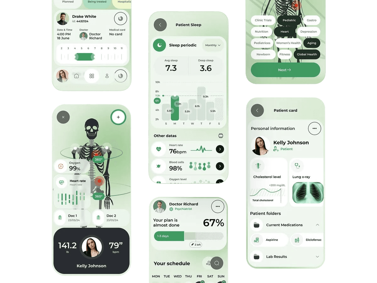


Visual Style
1
Moodboarding
The visual direction focuses on a clean, calm, and trustworthy healthcare experience, with an emphasis on simplicity and easy understanding. Inspired by modern health apps, organized medical records, and clear data visuals, the moodboard combines soft neutral surfaces with strong typography and subtle accents to create a friendly and reassuring feel. Following a 60:30:10 color ratio, 60% of the interface uses white and soft neutral tones to keep the experience open and comfortable, 30% uses black and deep gray for text, structure, and contrast, while 10% uses blue and fresh green accents to highlight actions, health information, and important states.
Visual Style
2
Color & Typology
The interface applies a 60:30:10 ratio for a clean, high-contrast visual experience. White and black form the 60% foundation for effortless reading, while subtle light blue gradients account for 30% secondary depth to create a calm atmosphere. A vibrant accent gradient serves as the 10% highlight for primary actions and AI features. Poppins was chosen for its geometric simplicity, high readability, and crisp appearance across note-taking and reading experiences.
Lato
SemiBold, 24 px
Medium, 18 px
Regular, 16 px
Medium, 14 px
#F4F4F4
#FFFFFF
#E2E9EE
#727272
#0A0A0A
#6EF54D
#F75959
Wireframes
Home
Notes
Track
AI Scan
Home
Notes
Track
AI Scan
Home
Notes
Track
AI Scan
Home
Notes
Track
AI Scan
From Files
From Camera
Ask AI
Home
Notes
Track
AI Scan
Home
Notes
Track
AI Scan
Home
Notes
Track
AI Scan
Home
Notes
History
AI Scan
Report Details or Doctor Snapshot
Home
Notes
History
AI Scan
Report Details or Doctor Snapshot
UI Design & Design Decsisions


Home Screen
Designed to solve health data fragmentation by serving as a single central hub that unifies smartwatch vitals, home logs, and paper medical records into one clean interface.

Enables instant lookup of scattered drugs, lab PDFs, and doctor notes, removing memory fatigue during consultations.
Organizes recent doctor visits and prescription notes chronologically for immediate access.
Offers a 1-tap connection to automatically pull continuous activity, sleep, and fitness metrics from wearables.
Visualizes active vitals and normal ranges in real time, making home tracking clear and reassurance-focused.
Provides a prominent 1-tap entry point to instantly scan new paper prescriptions or log vitals.
Scan Screen
Designed to eliminate manual data entry and solve paper fragmentation by giving users a frictionless, zero-learning-curve entry point to digitize medical documents.
Opens seamlessly over the dashboard, keeping context intact while minimizing cognitive load during urgent record uploads.
Allows immediate capture of physical paper scripts via camera or instant upload of email lab PDFs directly from device storage.
Multiple Language Selection

Notes Screen
Directly demonstrates the Two-Tier Data Model solution, giving users complete confidence by letting them toggle between AI-parsed text and untampered physical records.
Converts paper notes into structured, searchable cards with patient names, visit dates, and AI warning tags (e.g., "3 Medicine Names to verify") to highlight low-confidence OCR text.
Quick icons allow instant sorting across both raw files and parsed cards to completely eliminate memory fatigue.
Quick icons allow instant sorting across both raw files and parsed cards to completely eliminate memory fatigue.
Provides an immediate 1-tap tab bar so patients and doctors can cross-reference extracted text against the original document in seconds during consultations.
Stores raw scanned PDFs and prescription photos directly alongside parsed notes to preserve original doctor signatures and legal medical proof.


Track Screen
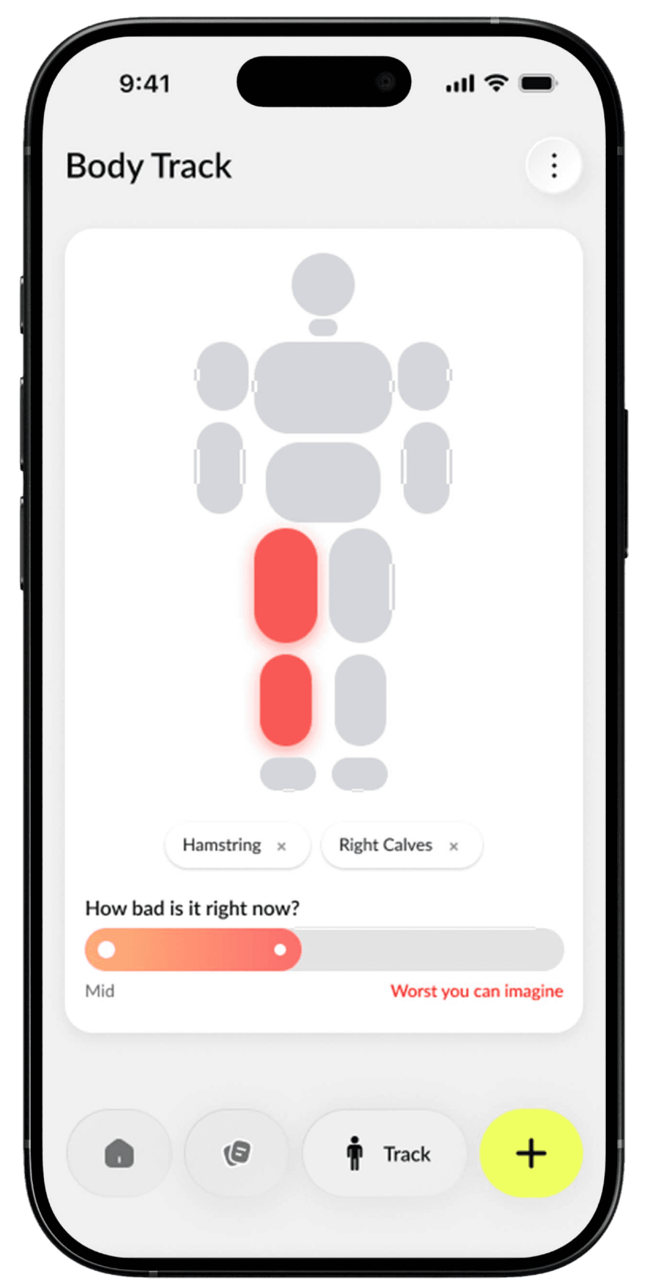
Designed to solve high-stress memory fatigue by giving patients an intuitive, low-effort visual way to map exact pain locations and severity without typing complex medical terms.
Replaces text-heavy medical descriptions with a clear, segment-based human body graphic, allowing users to tap precise affected areas (e.g., Hamstrings, Right Calves).
Uses a smooth color gradient and qualitative anchors ("Mid" to "Worst you can imagine") so patients can convey symptom severity accurately to their doctor.
Instantly creates removable contextual tags based on selected body regions, ensuring accurate, high-signal data logging.

Diagnose Screen
Designed to solve high-stress memory fatigue by giving patients an intuitive, low-effort visual way to map exact pain locations and severity without typing complex medical terms.
Displays real-time heart rate graphs (82 BPM) against historical baselines (72 BPM), giving doctors high-signal trend lines during visits.
Uses non-alarmist, reassuring feedback ("You are calm and relaxed") paired with visual tags (Stress, Recovery) to inform users of their status without triggering anxiety.
Logs heart rate variability and response intervals (851 ms) to track subtle physiological patterns over time without visual clutter.

Doctor Snapshots
Solves the 10-minute consultation limit by compiling scattered records into a high-signal 1-page summary while giving doctors instant access to original paper proof to eliminate clinical risk.
Groups patient details, critical allergies, medical history, and current dosage instructions into a structured, scannable format for 30-second clinical reviews.
Highlights unclear handwritten text with a clear alert tag ("1 Needs verification") to prevent medical errors and prompt immediate doctor review.
Tap-to-view raw paper slip viewer preserves original doctor handwriting, clinic stamps, and signatures so physicians can cross-reference data with 100% confidence.


Features a prominent "Share with doctor" primary CTA button on both screens to instantly export and send structured 1-page PDF summaries via WhatsApp before consultations
AI Verification & Human-in-the-Loop Workflow
Solves the risk of OCR inaccuracies by combining automated AI scanning with a mandatory human verification step, giving patients full control over their record accuracy.
Opens an inline crop of the original handwritten slip directly next to extracted text ("What we could read"), allowing users to verify ambiguous terms without leaving the screen.
Features direct CTA buttons ("Edit Medication" / "Keep Unclear") so users can correct misread drug names or defer clarification to their doctor.
Replaces yellow warning alerts with a bright green "Confirmed" status badge (e.g., Medicine Name - Amoxicillin) once validated, establishing user trust.
Displays an "Added By You" tag to clearly distinguish human-verified inputs from raw AI extractions for accurate record history.


Usability Testing & Iterative Design Changes
To validate HealthTrace, I conducted usability testing sessions with 5 Patients (managing chronic conditions or paper slips) and 3 General Practitioners. Participants completed key tasks to test record retrieval, prescription scanning, and pre-visit sharing workflows.
1
User Feedback
I can't risk an AI misreading my medication dosage, and as a doctor, I won't rely on typed text without seeing the original handwriting.
Design Change
Introduced the Two-Tier Data Model. Added an explicit yellow warning badge ("1 Needs verification") on low-confidence extractions, along with an inline split view modal comparing the raw physical paper crop against the parsed text.


After
Before


2
User Feedback
When I'm in pain, reading through long text lists or typing anatomical names like 'Hamstring' or 'Right Calves' takes too much cognitive effort. I just want to tap where it hurts.
Design Change
Replaced repetitive text-based condition cards with an interactive visual body map. Users can tap precise anatomical regions to auto-generate symptom tags and set severity via a visual slider.
Before

After
Key Learnings & Takeaways
1
Designing for High-Stress Contexts
Learned that in medical apps, clarity and reassurance must trump aesthetic ornamentation. Reducing visual noise directly lowers patient anxiety.
2
Human-in-the-Loop is Critical for AI Trust
OCR and AI features only work when users have full transparency. Providing side-by-side original paper proof with verification toggles was the single biggest driver of user confidence.
3
Designing for Dual Audiences
Balancing the distinct needs of anxious, non-technical patients with speed-focused, time-pressed doctors required tight prioritization of high-signal visual hierarchies.
4
Anticipated Impact & Results
Streamlined how patients organize paper scripts and vitals before doctor visits.
5
30-Second Doctor Scans
Enabled physicians to review patient history, active drugs, and raw proof in under half a minute during 10-minute consultations.
6
Zero Guesswork OCR
Built a 100% audit-backed system where no digitized record exists without its original source proof.
Thank you for reading! HealthTrace was built to bridge the gap between messy real-world paper scripts and digital clinical workflows. I’d love to connect and talk more about product design, design systems, or AI UX.


