VoiceToNotes
AI Notes and Reading
Service: Website Design
Client: Web3Task
Year: 2026
VoiceToNotes
VoiceToNotes
AI Notes and Reading
AI Notes and Reading
Service: Website Design
Service: Website Design
Client: Web3Task
Client: Web3Task
Year: 2026
Year: 2026


About VoiceToNotes
About VoiceToNotes
About VoiceToNotes
VoiceToNotes.ai is an intelligent, voice-first workspace designed to bridge the gap between productivity and leisure. By combining AI-driven note-taking with an integrated library of 100+ novels, it allows users to effortlessly capture ideas, structure knowledge, and dive into stories across all their devices.
VoiceToNotes.ai is an intelligent, voice-first workspace designed to bridge the gap between productivity and leisure. By combining AI-driven note-taking with an integrated library of 100+ novels, it allows users to effortlessly capture ideas, structure knowledge, and dive into stories across all their devices.
VoiceToNotes.ai is an intelligent, voice-first workspace designed to bridge the gap between productivity and leisure. By combining AI-driven note-taking with an integrated library of 100+ novels, it allows users to effortlessly capture ideas, structure knowledge, and dive into stories across all their devices.

Problem Statement
Problem Solution
I designed a conversion-focused landing page that communicates the product's value immediately, reinforces trust through thoughtful branding and visual hierarchy, and guides users naturally toward taking action without overwhelming them.
VoiceToNotes.ai offers a powerful AI transcription experience, but first-time visitors had only a few seconds to understand what the product does and why they should trust it. Without a clear value proposition and a guided experience, users could leave before discovering the product's true potential.
Design Process
Identify Opportunities
Set Goals
User Research
Prototyping
Review
2
Define
User Personas
Journey Map
Information Architecture
3
Develop
Wireframes
Hi-Fi Prototyping
Branding & Design Systems
3
Test
Usability Testing
Implementing Feedback
1
Discover
In-Depth Interviews
Competitive Analysis
Affinity Mapping
Design Process
Identify Opportunities
Set Goals
User Research
Prototyping
Review
1
Discover
In-Depth Interviews
Competitive Analysis
Affinity Mapping
2
Define
User Personas
Journey Map
Information Architecture
3
Develop
Wireframes
Hi-Fi Prototyping
Branding & Design Systems
3
Test
Usability Testing
Implementing Feedback
Problem Statement
Problem Solution
I designed a conversion-focused landing page that communicates the product's value immediately, reinforces trust through thoughtful branding and visual hierarchy, and guides users naturally toward taking action without overwhelming them.
Overview
VoiceToNotes.ai offers a powerful AI transcription experience, but first-time visitors had only a few seconds to understand what the product does and why they should trust it. Without a clear value proposition and a guided experience, users could leave before discovering the product's true potential.

User Insights
What our users need, think & care about
We interviewed potential users, studied reviews, and analyzed competitors to uncover what matters most. These insights directly shaped the structure, content and experience of the VoiceNotes.ai landing page.
Key Takeaway
"I just want to know quickly what it does, if I can trust it, and how it will help me — then I'm ready to try it."
— Interview Participant
Pain Points
Unclear value in seconds
Many AI tools fail to communicate what they do clearly. Users leave before understanding the value.
Trust & accuracy concerns
Features worry about accuracy, data safety, and reliability before trying any AI tool.
Too much information
Feature-heavy landing pages overwhelm users, competing content makes decision-making harder.
No clear next step
Unclear or weak CTAs fail to create momentum and reduce the chances of sign-up.
Want to see it in action
Users prefer real examples or previews over text to understand how the product works.
User Insights
What our users need, think & care about
We interviewed potential users, studied reviews, and analyzed competitors to uncover what matters most. These insights directly shaped the structure, content and experience of the VoiceNotes.ai landing page.
Key Takeaway
"I just want to know quickly what it does, if I can trust it, and how it will help me — then I'm ready to try it."
— Interview Participant
Pain Points
Unclear value in seconds
Many AI tools fail to communicate what they do clearly. Users leave before understanding the value.
Trust & accuracy concerns
Features worry about accuracy, data safety, and reliability before trying any AI tool.
Too much information
Feature-heavy landing pages overwhelm users, competing content makes decision-making harder.
No clear next step
Unclear or weak CTAs fail to create momentum and reduce the chances of sign-up.
Want to see it in action
Users prefer real examples or previews over text to understand how the product works.

Research
Wrong Assumption
Wireframes
Feedback
UI Design
Change in Requirements
Iterate
Technical Constraint
Testing
Difficult Trade-off
Dead End
Success
What Really Happened
Looking back, the biggest takeaway wasn't the final UI—it was everything that happened before it. Research uncovered new insights, feedback challenged my assumptions, requirements evolved, and some ideas simply didn't work as expected. By staying open to iteration instead of chasing a perfect first solution, I was able to create a stronger, more thoughtful experience that balanced user needs with business and technical goals.

When the first, second and third idea doesn't work.

When the final solution finally clicks.
Research
Wrong Assumption
Wireframes
Feedback
UI Design
Change in Requirements
Iterate
Technical Constraint
Testing
Difficult Trade-off
Dead End
Success
What Really Happened
Looking back, the biggest takeaway wasn't the final UI—it was everything that happened before it. Research uncovered new insights, feedback challenged my assumptions, requirements evolved, and some ideas simply didn't work as expected. By staying open to iteration instead of chasing a perfect first solution, I was able to create a stronger, more thoughtful experience that balanced user needs with business and technical goals.
When the first, second and third idea doesn't work.
When the final solution finally clicks.
Visual Design
Visual Design
The design focuses on creating a balance between visual appeal and usability, helping users quickly understand the product, explore its capabilities with confidence, and navigate the experience without unnecessary friction. Every element is designed to support clarity, trust, and a seamless user journey.
Typography & Colors
Typography & Colors
SS Pro
SS Pro
Regular
Regular
Medium
Medium
SemiBold
SemiBold
Aa
Aa
Bb Cc Dd Ee Ff Gg Hh Li Jj Kk Ll Mm Nn
Oo Pp Qq Rr Ss Tt Uu Vv Ww
Xx Yy Zz
Bb Cc Dd Ee Ff Gg Hh Li Jj Kk Ll Mm Nn
Oo Pp Qq Rr Ss Tt Uu Vv Ww
Xx Yy Zz
1A1A1A
1A1A1A
4B5563
4B5563
FF0D4A
FF0D4A
A8A29E
A8A29E
Style Overview
Style Overview
Design System
Design System
VoiceToNotes
VoiceToNotes
VoiceToNotes
VoiceToNotes
Heading
Heading
Sed ut perspiciatis unde omnis iste natus error sit voluptatem accusantium doloremque laudantium, totam rem aperiam,
Sed ut perspiciatis unde omnis iste natus error sit voluptatem accusantium doloremque laudantium, totam rem aperiam,
Heading
Heading
Sed ut perspiciatis unde omnis iste natus error sit voluptatem accusantium doloremque laudantium, totam rem aperiam,
Sed ut perspiciatis unde omnis iste natus error sit voluptatem accusantium doloremque laudantium, totam rem aperiam,
What is VoiceToNotes, and how does it work?
What is VoiceToNotes, and how does it work?
VoiceToNotes is an intelligent AI workspace that transforms your voice into structured knowledge. Unlike standard recorders that just save audio files, our engine listens, transcribes, and organizes your thoughts in real-time.
VoiceToNotes is an intelligent AI workspace that transforms your voice into structured knowledge. Unlike standard recorders that just save audio files, our engine listens, transcribes, and organizes your thoughts in real-time.

The Final Product
The Final Product

Problem Statement
Problem Solution
VoiceToNotes.ai offers a powerful AI transcription experience, but first-time visitors had only a few seconds to understand what the product does and why they should trust it. Without a clear value proposition and a guided experience, users could leave before discovering the product's true potential.
I designed a conversion-focused landing page that communicates the product's value immediately, reinforces trust through thoughtful branding and visual hierarchy, and guides users naturally toward taking action without overwhelming them.
Overview
Design Process
Set Goals
User Research
Identify Opportunities
Prototyping
Review
1
Discover
In-Depth Interviews
Competitive Analysis
Affinity Mapping
3
Develop
Wireframes
Hi-Fi Prototyping
Branding & Design Systems
3
Test
Usability Testing
Implementing Feedback
2
Define
User Personas
Journey Map
Information Architecture
User Insights
What our users need, think & care about
We interviewed potential users, studied reviews, and analyzed competitors to uncover what matters most. These insights directly shaped the structure, content and experience of the VoiceNotes.ai landing page.
Pain Points
Unclear value in seconds
Many AI tools fail to communicate what they do clearly. Users leave before understanding the value.
Trust & accuracy concerns
Features worry about accuracy, data safety, and reliability before trying any AI tool.
Too much information
Feature-heavy landing pages overwhelm users, competing content makes decision-making harder.
No clear next step
Unclear or weak CTAs fail to create momentum and reduce the chances of sign-up.
Want to see it in action
Users prefer real examples or previews over text to understand how the product works.
Key Takeaway
"I just want to know quickly what it does, if I can trust it, and how it will help me — then I'm ready to try it."
— Interview Participant
Key Insights
01
Clarity drives engagement
Users want to instantly understand what the product does and how it helps them — before they commit any time to exploring it.
02
Trust builds confidence
Trust triggers healthy skepticism. Users look for signals of accuracy, data safety, and social proof before trying any AI product.
03
Seeing is believing
Abstract claims fall flat. Included an interactive demo or real examples to show the product in action.
04
Simple path to get started
A clear and prominent call-to-action removes friction and substantially boosts conversions when paired with low commitment messaging.
Information Architecture
Navigation
Features
Pricing
Blog
Sign Up
Log In
Hero Section
Headline
Sub-headline
Get Started CTA
Authentication
Sign Up
Log In
Password Reset
Trust & Founders
As Seen On
Ratings
Founders
Team
User Reviews
Testimonials
Star Ratings
Reviews CTAs
How It Works
Step 1 – Record
Step 2 – Transcribe
Step 3 – Refine
Use Cases
Students
Professionals
Writers
Product Ecosystem
Integrations
Downloads
Platforms
Social Proof
Press Mentions
Awards
Statistics
Pricing
Free Plan
Pro Plan
Enterprise
Comparison
Final CTA
Primary CTA
Secondary CTA
Footer
Navigation Links
Legal / Privacy
Social Links
Copyright
01
User-Centric Planning
Every section is designed around user intent and the questions they arrive with.
02
Progressive Disclosure
Information is revealed in layers — overview first, depth on demand.
03
Trust First
Social proof and credibility signals appear early to reduce friction.
04
Action-Oriented
Clear CTAs are placed at every natural decision point in the journey.
What Really Happened
Looking back, the biggest takeaway wasn't the final UI—it was everything that happened before it. Research uncovered new insights, feedback challenged my assumptions, requirements evolved, and some ideas simply didn't work as expected. By staying open to iteration instead of chasing a perfect first solution, I was able to create a stronger, more thoughtful experience that balanced user needs with business and technical goals.
When the first, second and third idea doesn't work.
When the final solution finally clicks.
Research
Wrong Assumption
Wireframes
Feedback
UI Design
Change in Requirements
Iterate
Technical Constraint
Testing
Difficult Trade-off
Dead End
Success
Visual Design
The design focuses on creating a balance between visual appeal and usability, helping users quickly understand the product, explore its capabilities with confidence, and navigate the experience without unnecessary friction. Every element is designed to support clarity, trust, and a seamless user journey.
Typography & Colors
SS Pro
Regular
Medium
SemiBold
Aa
Bb Cc Dd Ee Ff Gg Hh Li Jj Kk Ll Mm Nn
Oo Pp Qq Rr Ss Tt Uu Vv Ww
Xx Yy Zz
12px
16px
24px
36px
48px
72px
1A1A1A
4B5563
FF0D4A
A8A29E
Style Overview
Design System
VoiceToNotes
VoiceToNotes
Heading
Sed ut perspiciatis unde omnis iste natus error sit voluptatem accusantium doloremque laudantium, totam rem aperiam,
Heading
Sed ut perspiciatis unde omnis iste natus error sit voluptatem accusantium doloremque laudantium, totam rem aperiam,
What is VoiceToNotes, and how does it work?
VoiceToNotes is an intelligent AI workspace that transforms your voice into structured knowledge. Unlike standard recorders that just save audio files, our engine listens, transcribes, and organizes your thoughts in real-time.
The Final Product

Footer
Footer
Footer
I wanted the footer to feel useful rather than overlooked. In addition to providing access to important pages, I included a simple subscription section for users who may not be ready to sign up but still want to follow the product's journey and receive future updates.
I wanted the footer to feel useful rather than overlooked. In addition to providing access to important pages, I included a simple subscription section for users who may not be ready to sign up but still want to follow the product's journey and receive future updates.
Feature Section
Feature Section
Feature Section
My goal was to make the feature section feel like a guided product tour rather than a static list of capabilities. Each scroll introduces a new mobile screen and explains its purpose, allowing users to explore the platform progressively while maintaining focus on one feature at a time.
Although the animation isn't visible in this case study, it plays an important role in pacing the experience and making the product easier to understand.
My goal was to make the feature section feel like a guided product tour rather than a static list of capabilities. Each scroll introduces a new mobile screen and explains its purpose, allowing users to explore the platform progressively while maintaining focus on one feature at a time.

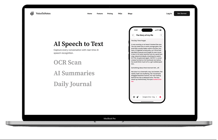
Creating a Unified Experience
Creating a Unified Experience
Creating a Unified Experience
I wanted this section to feel like the product coming together. Instead of focusing on a single device, I showcased the entire ecosystem to communicate that VoiceToNotes is designed to fit naturally into a user's everyday workflow. Whether they're using a desktop, mobile phone, or smartwatch, the experience remains connected and consistent.
I wanted this section to feel like the product coming together. Instead of focusing on a single device, I showcased the entire ecosystem to communicate that VoiceToNotes is designed to fit naturally into a user's everyday workflow. Whether they're using a desktop, mobile phone, or smartwatch, the experience remains connected and consistent.


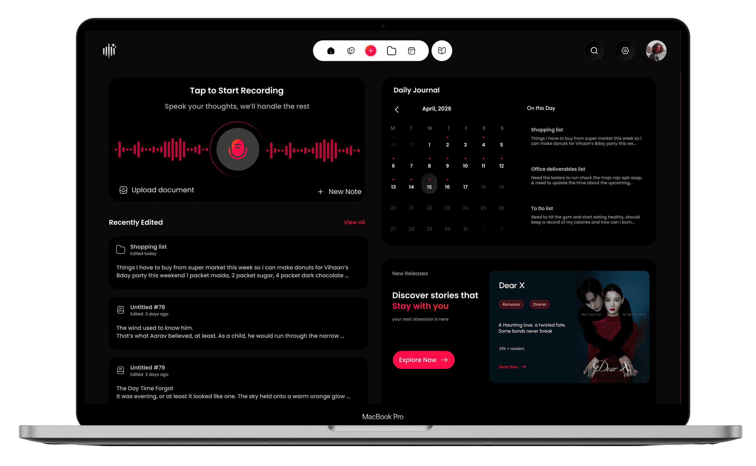
Desktop Experience
Desktop Experience
Desktop Experience
After introducing the product through the mobile experience, I wanted to reassure users that VoiceToNotes isn't limited to a phone.
Showcasing the desktop workspace early helps establish it as a complete cross-platform product, allowing users to immediately understand that they can simply log in and continue their work from any device.
After introducing the product through the mobile experience, I wanted to reassure users that VoiceToNotes isn't limited to a phone.
Showcasing the desktop workspace early helps establish it as a complete cross-platform product, allowing users to immediately understand that they can simply log in and continue their work from any device.
After introducing the product through the mobile experience, I wanted to reassure users that VoiceToNotes isn't limited to a phone.
Hero Section
Hero Section
The hero section was designed to introduce VoiceToNotes' two core experiences—Editor and Novels—from the very first interaction. Instead of relying on a single static mockup, a split animation reveals both interfaces simultaneously, creating a memorable first impression while helping users immediately understand the platform's versatility.
The hero section was designed to introduce VoiceToNotes' two core experiences—Editor and Novels—from the very first interaction. Instead of relying on a single static mockup, a split animation reveals both interfaces simultaneously, creating a memorable first impression while helping users immediately understand the platform's versatility.
Concept
Concept
The navigation prioritizes Log In and Get Mobile App, giving returning users quick access while encouraging new visitors to download the app. Contextual call-to-action buttons placed alongside each mockup guide users toward the experience most relevant to them, making the hero both engaging and conversion-focused.
The navigation prioritizes Log In and Get Mobile App, giving returning users quick access while encouraging new visitors to download the app. Contextual call-to-action buttons placed alongside each mockup guide users toward the experience most relevant to them, making the hero both engaging and conversion-focused.
Design Decision
Design Decision


Hero Section
The hero section was designed to introduce VoiceToNotes' two core experiences—Editor and Novels—from the very first interaction. Instead of relying on a single static mockup, a split animation reveals both interfaces simultaneously, creating a memorable first impression while helping users immediately understand the platform's versatility.
Concept
The navigation prioritizes Log In and Get Mobile App, giving returning users quick access while encouraging new visitors to download the app. Contextual call-to-action buttons placed alongside each mockup guide users toward the experience most relevant to them, making the hero both engaging and conversion-focused.
Design Decision


